Developer Log - 05/03/21


Approach
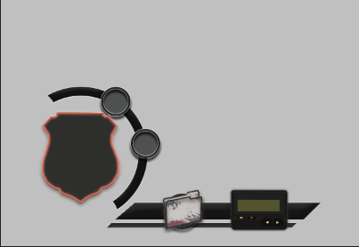
The approach for this design was to present to the player a minimal layout displaying where their "health" and equipment is to prevent unnecessary contextual information, instead I wanted the player to instantly recognise what they're role is in the game, the character that they play as and what they have access to. To avoid spoliers of the game's premise I'll leave it at that.
My lack of experience for designing user interface elements might be prominent in this showing, yet I began with the design process because I'm more versed in arranging how something might appear to an audience than the technical functions that relate tothe player.
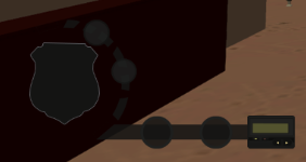
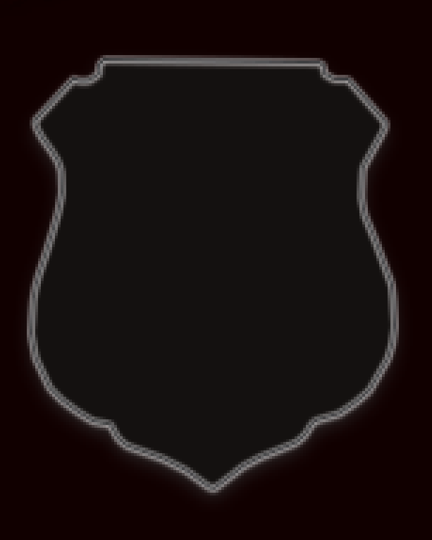
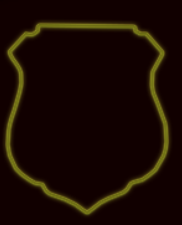
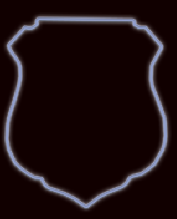
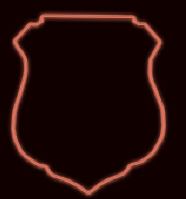
Badge
For the badge's hues, I mostly used inner glow, outer glow, and bevel and embross for a bold and clean radiance to at least create a foundation for motion graphics to be applied later.
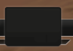
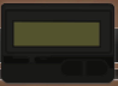
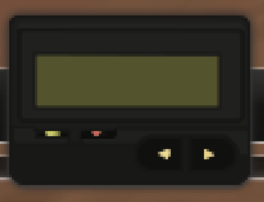
Pager
Utilised the shapes and lasso tool to create a somewhat pixelated version for a pager that shows the screen for objectives to show up, the buttons to resemble the real-life counterpart and used outer glow to highlight the pager to stand out from the background tool bar.
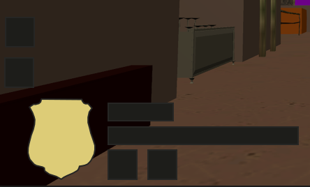
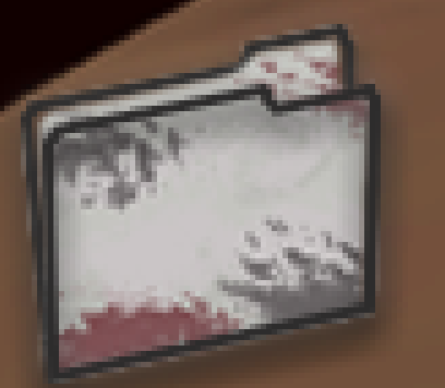
Folder
**Heavily story related** Outlined the folder split into two parts to reduce overlap and clipping for the shapes, and then copy selected the merged layers to fill in with a slightly grey colour and used the brush tool to create smudges with a reduced opacity.
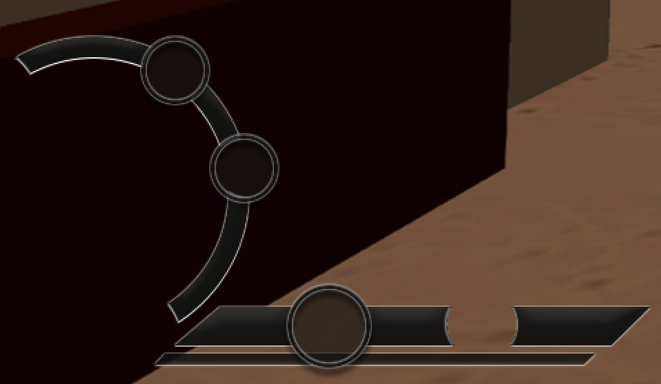
Radial Bar
Cut into the ellipses shape tool to have not quite a semi-circle that contains tool slots for equipment to occupy when acquired by the player. Blending changes applied were bevel and embross, inner glow, outer glow, and gradient overlay, that is at lower opacity to not stand out too much in comparison to the badge and tool slots.
Get Creative Habit Jam
Creative Habit Jam
Creative Development
More posts
- Developer Log - 16/03/21Mar 16, 2021
- Developer Log - 09/03/21Mar 16, 2021
- Developer Log - 02/03/21Mar 16, 2021
- Developer Log - 1/03/21Mar 16, 2021
Leave a comment
Log in with itch.io to leave a comment.